5.1.4 Creating custom UI
The custom component settings screen is designed to allow users to freely enter JSON or string as parameter by default. However, this means that in cases where you are not the author of the program, you have to look at the source code of the custom component in order to find out what items are set as parameters, which requires extra time and effort.
To avoid this problem, with this product you can customize the parameter field on the custom component settings screen. You can define what items to place as parameter fields so as to make it easier for users to understand what parameters need to be entered.
5.1.4.1 Creating Custom UI#
You can create a custom UI in the following ways. There are two forms of custom UI, each created in a different way:
-
JSON for Synapse custom UI
In this method, the component settings are written in a JSON file. All you need to do is create a JSON file, and if you need to modify it, you can simply modify the JSON file. Instead, you can only define settings within the range of features provided by Synapse and cannot create complex UIs.
-
HTML for Synapse custom UI
Use HTML and JavaScript to create component settings.
The HTML file can be created however the user wants, and complex UI can be implemented by utilizing JavaScript, CSS, images, etc. Furthermore, it supports a multilingual UI. However, basic knowledge of HTML and JavaScript is required to create HTML files.
Also, in a simple implementation, the look and feel will be different from the screens on Synapse.
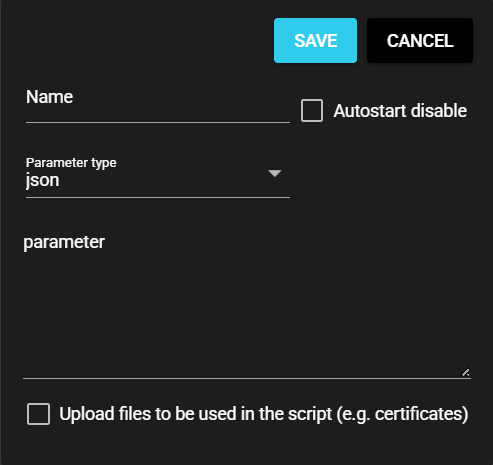
Custom UI can only be created for the elements associated with the "parameters" within the red frame in the image; the elements outside cannot be edited.
-
[Save] button
Saves the component settings you entered.
-
[Cancel] button
Closes the Settings dialog.
-
Name, Autostart disable
This setting item is essential for running components.
-
Upload files to be used in the script (e.g. certificates)
Manages the files (such as certificates) required during component execution.
5.1.4.2 Creating JSON Files for Synapse Custom UI#
A JSON file for custom UI can be created as follows:
5.1.4.2.1 Creating a JSON File#
You can create a JSON file for custom UI by following the steps below:
-
Create an empty json file in a text editor.
-
Within the json file, define an array called "parameter_defines."
-
In "parameter_defines," define the input elements to be displayed on the custom component screen. Define other elements such as "window_size" and "layout" as needed.
Definition file (json){ "window_size": "auto", "parameter_defines": [ { // Input element 1 }, { // Input element 2 }, { // Input element 3 } ... ] }The input elements displayed on the screen are defined using the following items:
Item Value type Required Description window_size string × Window size
{ "window_size" : "small" } (example)- auto/No specification - min-width: "400px"
- small - min-width: "33%"
- middle - min-width: "50%"
- large - min-width:"80%"
parameter_defines object ○ Parent element of item
(Nesting from the highest level to the next lower level can be specified. See sample)name string ○ Key to retain entered values in settings file label string ○ Item name displayed on the screen type string ○ Select the type of value you want to enter:
string: String
number: Integer
real: Real number
select: Optionmax number ○ Upper limit of input
Note: Valid only if type is number or real.min number × Lower limit of input
Note: Valid only if type is number or real.select array × Options
Note 1: Valid only if type is select.
Note 2: Options have "label" and "value" properties.
Define by object array.
Example: [{ "label":"option1", "value":1},
{ "label":"option2", "value":2}]default any × Default value require bool ○ Whether input is required or not array bool × Use an array or not layout object × Specification of width of each item. See sample
{ "layout" : { "col" : 2 }} (This example specifies col as 1 to 12)
When omitted, the default is 6.
When array and object are omitted, the default is 12.
5.1.4.2.2 Sample#
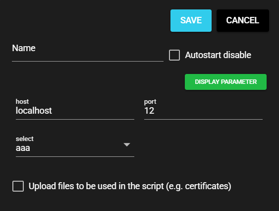
A sample custom UI definition file is shown below:
{
  "parameter_defines": [
    {
      "name": "host",
      "label": "Host",
      "type": "string",
      "default": "localhost",
      "require": true,
      "max":256
    },
    {
      "name": "port",
      "label": "Port",
      "type": "number",
      "max": 65535,
      "min": 1,
      "default": "12",
      "require": true
    },
    {
      "name": "select",
      "label": "Select",
      "type": "select",
      "select": [
        { "label":"aaa", "value":1},
        { "label":"bbb", "value":2}
      ],
      "default": 1,
      "require": false
    }
  ]
}
The resulting layout is as follows:
5.1.4.2.3 Sample with Nesting#
A sample custom UI definition file using nesting is shown below:
{
  "window_size": "middle",
  "parameter_defines": [
    {
      "name": "nested",
      "label": "Nested",
      "type": "object",
      "array": true,
      "parameter_defines": [
        {
          "name": "name",
          "label": "Wave name",
          "type": "string",
          "require": true,
          "max": 32,
          "default": "signal_5"
        },
        {
          "name": "freq",
          "label": "Frequency",
          "type": "select",
          "require": true,
          "select": [
            { "label": "1.0", "value": 1.0 },
            { "label": "2.0", "value": 2.0 }
          ],
          "default": 1.0
        },
        {
          "name": "amp",
          "label": "Amplitude",
          "type": "real",
          "require": true,
          "max": 100.0,
          "min": 0.1,
          "default": 1.0
        }
      ],
      "require": false,
      "default": [
        {
          "name": "signal_1",
          "freq": 1,
          "amp": 1.1
        },
        {
          "name": "signal_2",
          "freq": 2,
          "amp": 1.2
        }
      ]
    }
  ]
}
The resulting layout is as follows:
5.1.4.2.4 Sample Specifying Item Width#
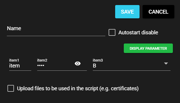
A sample custom UI definition file that specifies item width is shown below:
{
  "parameter_defines": [
    {
      "name": "item1",
      "label": "Item 1",
      "type": "string",
      "require": false,
      "max": 32,
      "default": "Komoku 1",
      "layout": {
        "col": 2
      }
    },
    {
      "name": "item2",
      "label": "Item 2",
      "type": "real",
      "require": false,
      "max": 32,
      "default": "12.3",
      "mask": true,
      "layout": {
        "col": 4
      }
    },
    {
      "name": "item3",
      "label": "Item 3",
      "type": "select",
      "require": false,
      "max": 32,
      "default": 2,
      "select": [
        { "label": "A", "value": 1},
        { "label": "B", "value": 2},
        { "label": "C", "value": 3}
      ],
      "layout": {
        "col": 6
      }
    }
  ]
}
The resulting layout is as follows:
5.1.4.3 Creating and Applying HTML for Synapse Custom UI#
This section explains how to create a custom UI in HTML and JavaScript.
5.1.4.3.1 Creating Custom UI#
The following environment is required to use custom UI in HTML format. Prepare this environment first.
You can add a sample component including custom UI in HTML format by using one of the following commands:
$ sccde add -t collector -u html
$ sccde add -t emitter -u html
The actual HTML files are placed in the component-specific directories under parameter_ui.
You can customize the html, js, and css files based on the sample you created.
5.1.4.3.2 HTML format details#
-
HTML file (index.html)
As with regular HTML, you can write definitions using HTML and BODY tags. The definitions in this file are displayed in place of the text entry area in the parameter settings dialog of the custom component.
Sample display

-
JavaScript file (index.js)
Certain functions need to be called when displaying a dialog or when saving parameters, so those functions must be defined in JavaScript. The JavaScript file should be read by the
<script>tag in the HTML file.Details will be described later.
Implementation Methods for Multilingual UI
When implementing a multilingual UI, it must be created according to the following format.
- Static implementation method(file: HTML)
File management costs will increase, but it will result in a simpler operational method.
Create files namedindex.{language}.htmland prepare separate HTML files for each language. For example,{language}is written asjafor Japanese andenfor English. The contents of the file must be written in the language matching the{language}of filename. - Dynamic implementation method(file: JavaScript)
File management is simplified, but processing within functions is required.
Dynamic multilingual switching is possible by using thelocaleparameter in the function that loads the custom UI to identify the current display language. For details, see the usage of theonLoad()function.
-
scc-info.json file
To communicate to the system that your custom component uses custom UI (HTML), you need the following definition for the component:
Property Description parameter-ui-type Specify 'html' parameter-ui-size Specify the Parameters dialog screen size. Selectable options are 'small', 'middle', 'large' and 'auto' (default is 'middle'). parameter-ui Specify the path to the directory containing HTML and JavaScript files.
5.1.4.3.3 JavaScript File Coding#
The following section explains the JavaScript processing when implementing custom UI in HTML, using the sample index.js source code as an example.
To enable JavaScript to work with Synapse information, a dedicated API object is provided for use with Synapse. This API object can be referenced as 'window.customUiLib.'
By registering a function with a specific property name in this object, you can exchange data with the Synapse screen.
async function onLoad(editable, param, isNewComponent, componentId, locale) {
  :
}
async function onSave() {
  :
}

// Registration of callback function
window.customUiLib.onSave = onSave;
window.customUiLib.onLoad = onLoad;
 :
There is also an API that can retrieve Synapse information.
For more information about these APIs, see Custom UI JS-API Reference.
5.1.4.3.4 Function Executed When the Parameters Dialog Appears#
When the custom component's parameter settings dialog is displayed, the onLoad() function registered in the custom UI JavaScript is called.
The following information is passed as arguments to this function, which should be reflected as elements in html as needed:
-
Whether dialog can be edited
In Run Mode,
falseis passed to theeditableargument to make the dialog input items not editable. See Controlling Edit Restrictions for more information. -
Set parameters
When editing a component parameter that is already created, the previously set parameter is passed to the
paramargument. -
Create or update
The value passed to the
isNewComponentargument istruewhen creating a new component and isfalseif the component is being updated. -
Component ID
The ID of the component is passed to the
componentIdargument. This information is passed as `undefined when you create a new component. -
Locale settings
The code of the currently selected language, such as
jaoren, is passed to thelocaleargument.
5.1.4.3.5 Function Executed When Saving Parameters Dialog#
When the Save button is clicked in the custom component's parameter settings dialog, the onSave() function registered in the custom UI JavaScript is called.
Return from this function the parameter to be saved.
5.1.4.3.6 Controlling Edit Restrictions#
Synapse has two screens: Run Mode and Edit Mode. In Run Mode you can operate the data collection flow, and in Edit Mode you can make settings for the data collection flow.
Custom UI defined in standard components or JSON files are restricted so that they cannot be edited in Run Mode. However, custom UI implemented in HTML do not have this restriction. Instead, use the editable argument of the onLoad() function to receive information on whether the custom UI is editable or not to implement user restriction on editing.
Basically, deactivate the custom UI by setting the HTML element "disable" to true.
async function onLoad(editable, param, isNewComponent, componentId, locale) {
  // Deactivate 'host' item in form if "editable" is false
  document.forms['form']['host'].disabled = !editable;
}
window.customUiLib.onLoad = onLoad;
Reference: HTML attributes: disabled
5.1.4.3.7 Sample Using npm#
Synapse uses Vue and Quaser to create screens.
While there may be some awkwardness in the screens made in plain HTML or CSS, by using npm, you can create UI using external packages such as Vue and Quaser.
The samples used in the explanation so far only use plain HTML, Javascript, and CSS, but samples that use Vue and Quaser are also provided.
Once the samples are downloaded, run the following command to generate html and js files under the dist directory:
These files can be placed and used in the SCCDE environment, just like regular html.
$ ls
sample_custom_ui_vue.zip
$ unzip sample_custom_ui_vue.zip
$ cd sample_custom_ui_vue
$ npm install
$ npm run build
$ ls dist
assets  index.html
Using npm
Node.js must be installed in order to use npm.
For more information about Node.js, including how to install it, visit the official Node.js site.
Official Node.js site: https://nodejs.org/en
5.1.4.4 Applying Custom UI (JSON) to Python Custom Component#
You can set custom UI in a Python custom component by registering a definition file created in Creating JSON File for Synapse Custom UI.
5.1.4.4.1 Register#
You can register custom UI by following these steps:
-
Press the Setting Menu icon and choose [Custom Components].
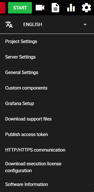
-
Select [Python(.py)] in the tab at the top of the dialog.

-
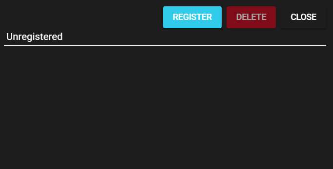
Press the UI icon (Set UI) for any custom component.

-
Press [Register] to register the definition file.

-
The wording "Registered" and the contents of the definition file are displayed.

-
The items defined in the file are displayed in the settings screen of the custom component for which the definition file is registered.

Display parameter
-
Press [Display parameter].
-
You can view the runtime parameters of the component that are generated from what you enter in the custom UI.

5.1.4.4.2 Delete#
You can use the following procedure to delete the registered definition file and return the screen to its default state.
-
Press the Setting Menu icon and choose [Custom Components].
-
Select [Python(.py)] in the tab at the top of the dialog.
-
Press the UI icon (Set UI) for the custom component for which the definition file is registered.
-
Press [Delete].
-
The registered definition file is deleted, and "Unregistered" is displayed.
-
The custom component settings screen returns to its default state.
5.1.4.5 Applying Custom UI (JSON) to C Custom Component#
You can set custom UI in a C custom component by registering a definition file created in Creating JSON File for Synapse Custom UI.
5.1.4.5.1 Register#
You can register custom UI by following these steps:
-
Press the Setting Menu icon and choose [Custom Components].
-
Select [C(.so)] in the tab at the top of the dialog.

-
Press the UI icon (Set UI) for any custom component.

-
Press [Register] to register the definition file.
-
The wording "Registered" and the contents of the definition file are displayed.

-
The items defined in the file are displayed in the settings screen of the custom component for which the definition file is registered.

Display parameter
-
Press [Display parameter].
-
You can view the runtime parameters of the component that are generated from what you enter in the custom UI.

5.1.4.5.2 Delete#
You can use the following procedure to delete the registered definition file and return the screen to its default state.
-
Press the Setting Menu icon and choose [Custom Components].
-
Select [C(.so)] in the tab at the top of the dialog.
-
Press the UI icon (Set UI) for the custom component for which the definition file is registered.
-
Press [Delete].
-
The registered definition file is deleted, and "Unregistered" is displayed.
-
The custom component settings screen returns to its default state.